Dana Manciagli: Trusted Voice in Job Search Strategy and Tactics
Three decades of hiring experience from Microsoft, IBM, and Kodak. Author, speaker, and career strategist who's helped thousands navigate their career journey.

About Dana
Dana Manciagli brings over 30 years of Fortune 500 leadership experience in global sales and marketing—and the insider's edge that only comes from sitting on the hiring side of the table.
She spent over a decade as Worldwide Sales General Manager at Microsoft and held executive roles at IBM, Kodak, and Avery Dennison. She's also taken a tech startup from launch to IPO.
Author of Cut the Crap, Get a Job! and the nationally syndicated Career Mojo columnist, Dana has reached millions with her direct, real-world career advice. Recognized by the Forbes Coaches Council and named one of Seattle's Women of Influence, she's a trusted voice in career strategy.
Armed with an MBA from Thunderbird School of Global Management, extensive non-profit experience, and the strength of a three-time breast cancer survivor, Dana leads with resilience, empathy, and results.
A Legacy of Results
Three decades of expertise translated into measurable impact for professionals at every career stage.
What Clients Say
Areas of Specialization
Three decades of Fortune 500 leadership. Thousands of coaching engagements. One proven approach.
Executive Career Strategy
Strategic positioning for senior-level professionals and executives seeking advancement or transition.
Job Search Steps
Proven job search techniques from the hiring side of Fortune 500 companies that actually get results.
Interview Mastery
Master the interview process with insider knowledge of how hiring managers evaluate candidates.
Corporate Hiring Insights
Inside knowledge of how hiring decisions are really made at the world's leading companies.
Career Transition Guidance
Navigating career pivots, industry changes, and major professional transitions with confidence.
Résumé and LinkedIn Profile Writing
Creating compelling professional narratives that stand out to hiring managers.
Networking Strategy
Building and leveraging professional networks that open doors to opportunities.
Veterans & Military Spouse Career Support
Specialized guidance for military community members transitioning to civilian careers.
Available For Select Engagements
Dana accepts a limited number of speaking and consulting engagements throughout the year.
Keynote Speaking
Engaging, actionable presentations that inspire and educate audiences on career success strategies.
- Career acceleration strategies
- Modern job search techniques
- Networking mastery
- Women in leadership
- Corporate career navigation
Webinars & Workshops
Interactive virtual sessions tailored for organizations seeking to empower their teams or members.
- Virtual sessions for organizations
- Corporate training programs
- University career services partnerships
- Professional association events
Interested in working together?
Inquire About AvailabilityBooks & Resources

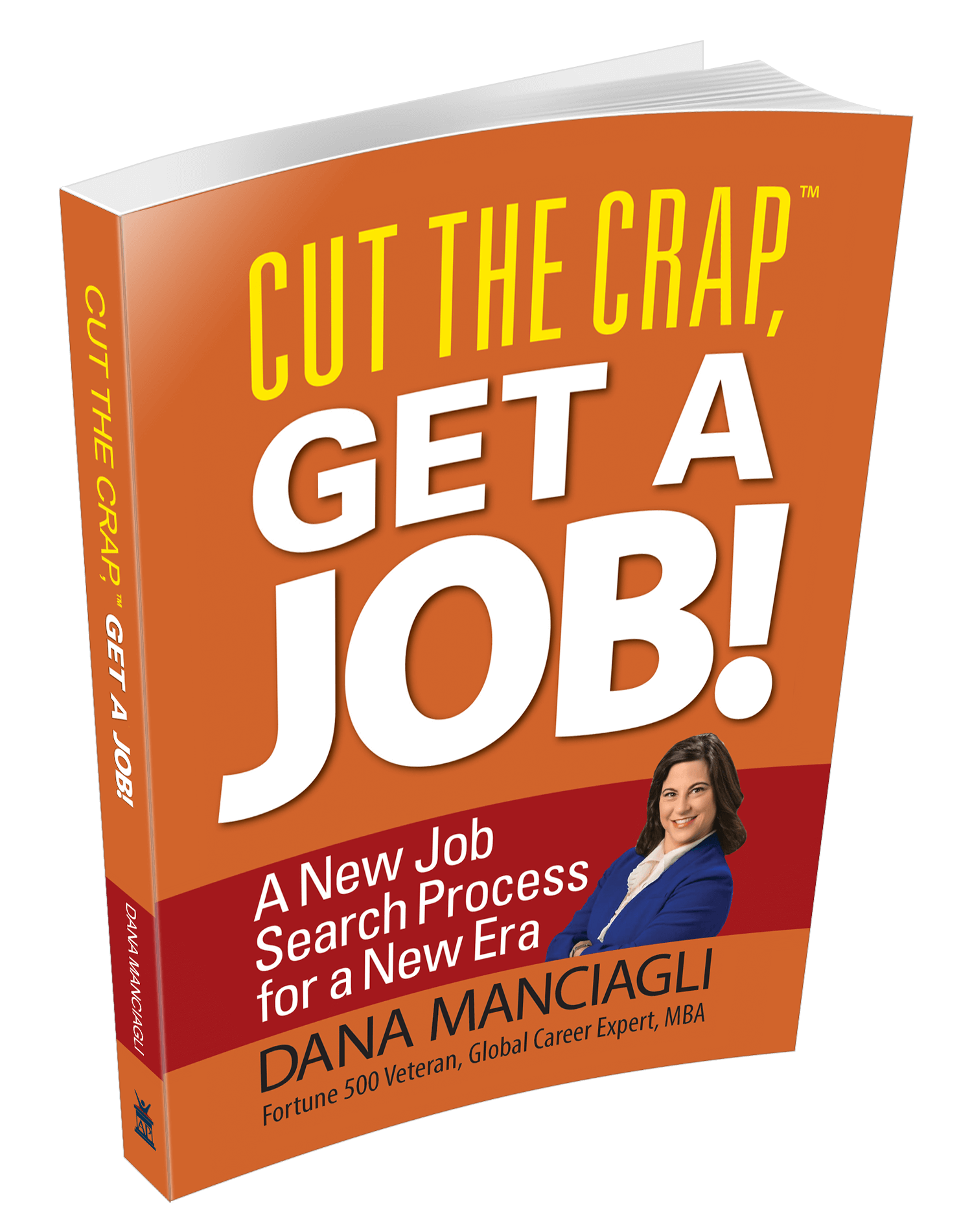
"Cut the Crap, Get a Job!"
A New Job Search Process for a New Era
Dana's no-nonsense guide to job searching in the modern era, based on three decades of Fortune 500 hiring experience. Learn the insider tactics that actually work when you're competing for your dream role.

Free Career Advice Blog
Access practical career advice, job search strategies, and professional development insights from Dana's decades of experience.
Read the Blog →
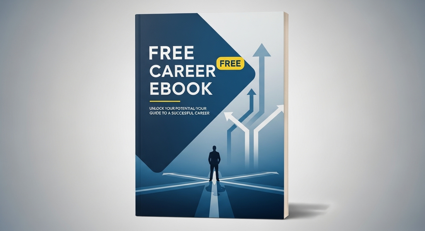
Free E-Book
Download Dana's free e-book with essential career strategies and job search tips to accelerate your professional journey.
Download E-Book →
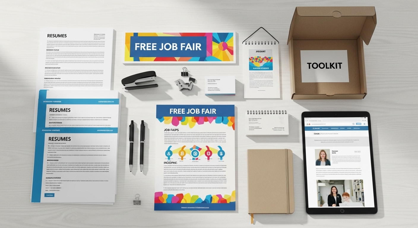
Free Job Fair Toolkit
Get Dana's comprehensive job fair toolkit with proven strategies to maximize your success at career events.
Download Toolkit →Let's Connect
Interested in speaking engagements, consulting, or media inquiries? Please reach out using the form below.


